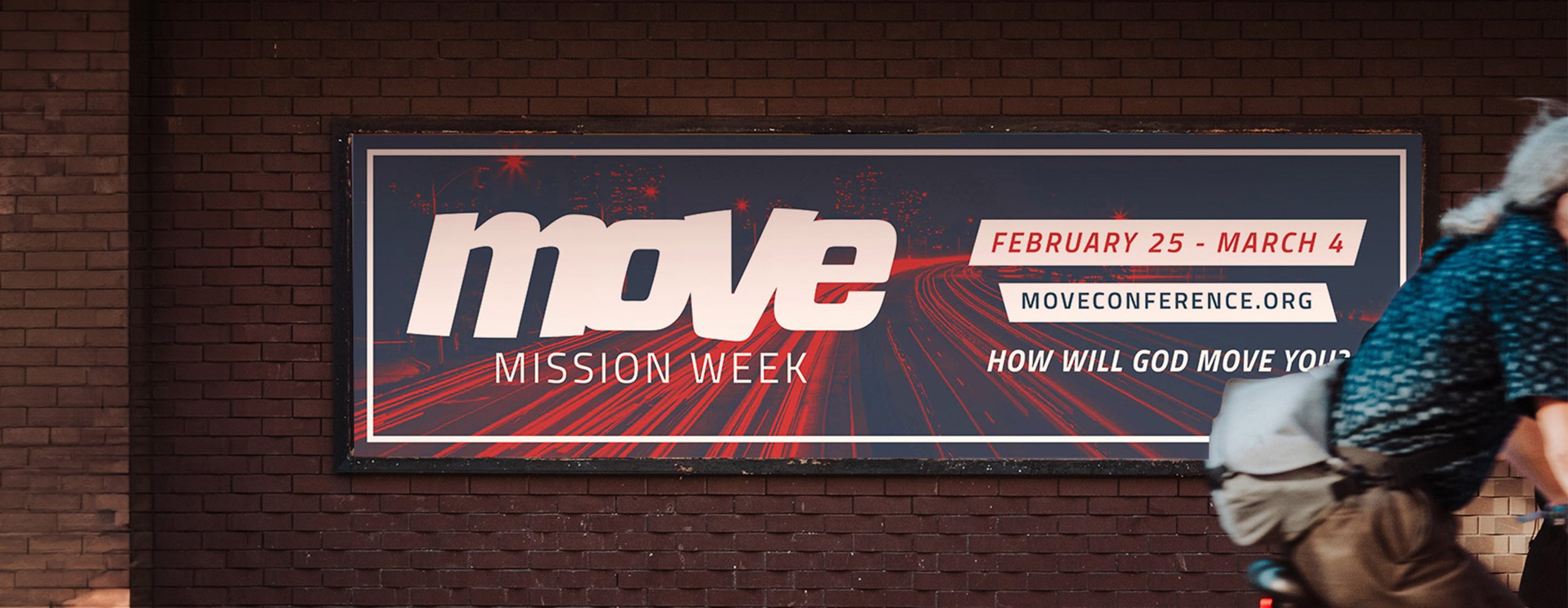
MOVE Conference
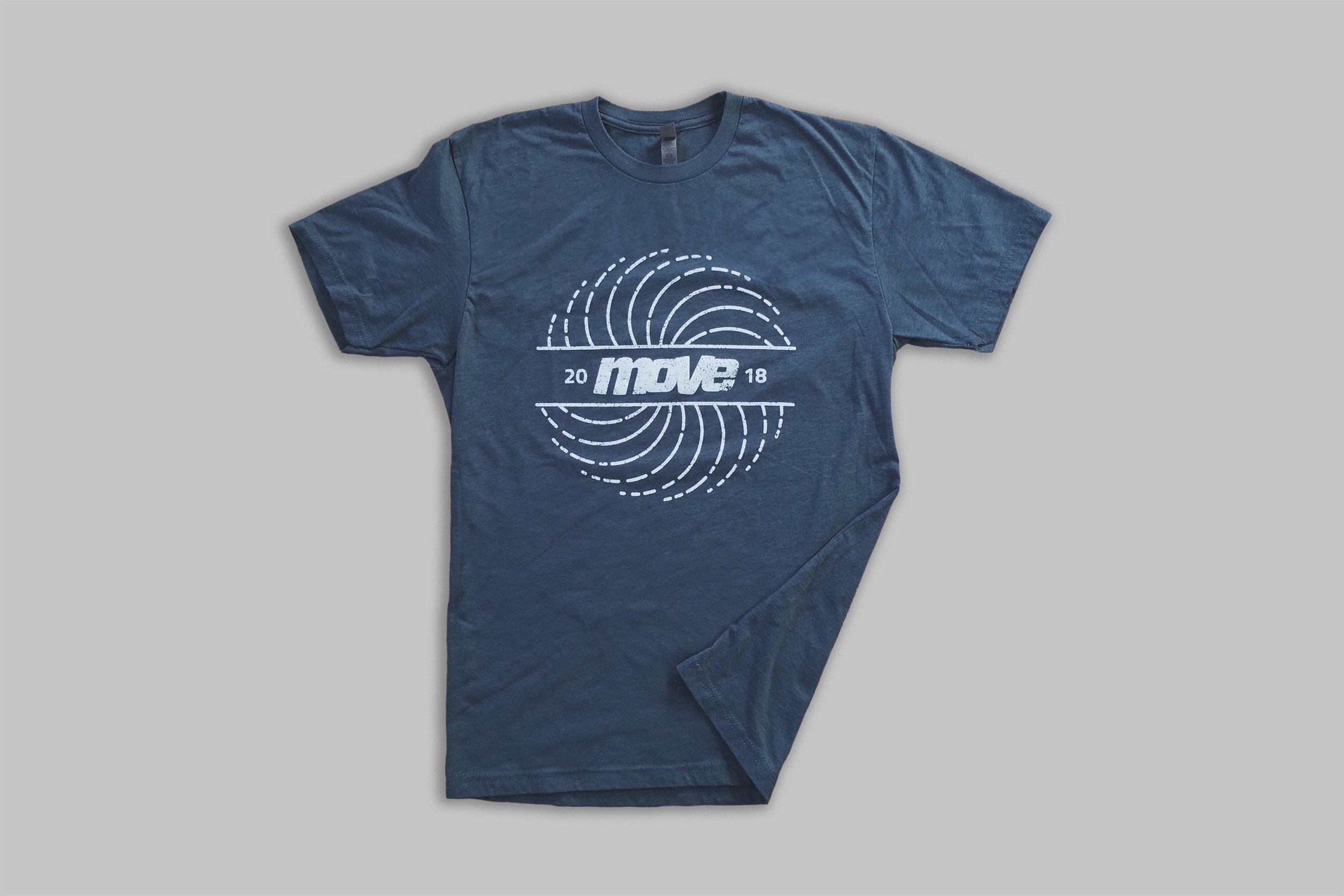
MOVE Conference is aimed at those dedicated to spreading the gospel locally, nationally, and internationally, hosting around 300 guests over 3 days in Atlanta, Georgia. I started two months before the event's launch and was provided with the logo, brand colors, and a few mood images. My role involved creating visual assets using the established framework across multiple channels, such as print, digital media, and merchandise. Additional responsibilities included copywriting, project management, and direct communication with vendors to ensure timely delivery of all materials.
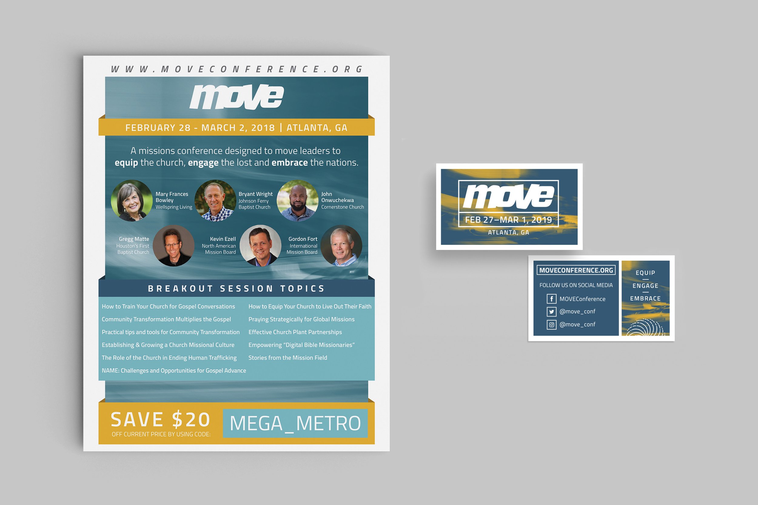
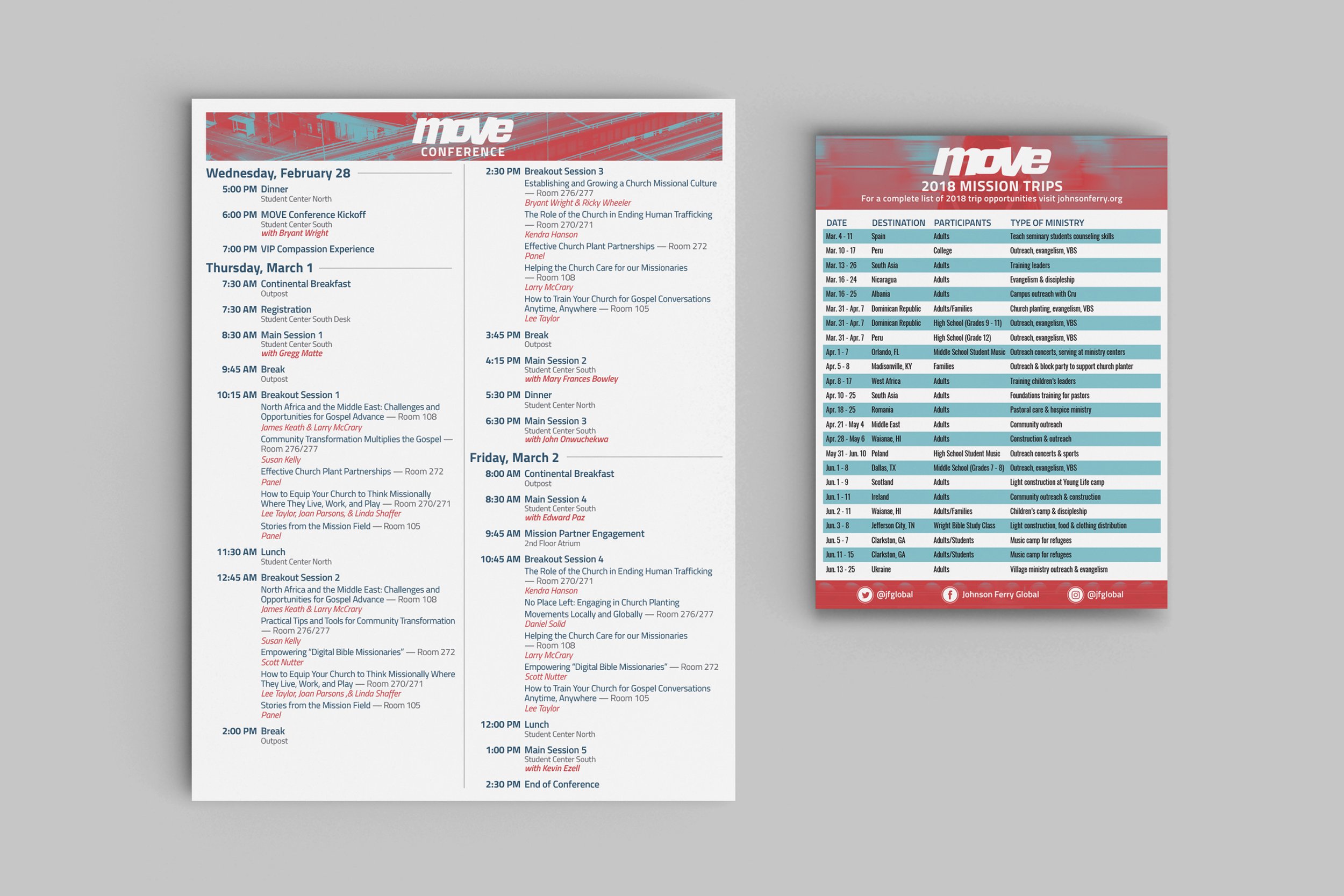

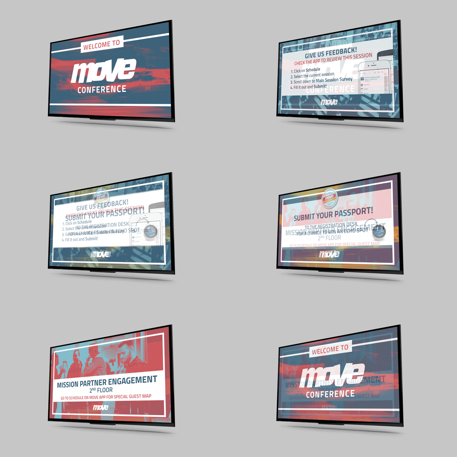
When designing for a multiple-day conference, it was important to think of the guests’ journey and how they may navigate and use the materials given to them. A simple way to do this was through color. Dark blue was the primary color for general MOVE promotion. Red was the primary color for communications related to the schedule. Yellow was the primary color for secondary activities and events.


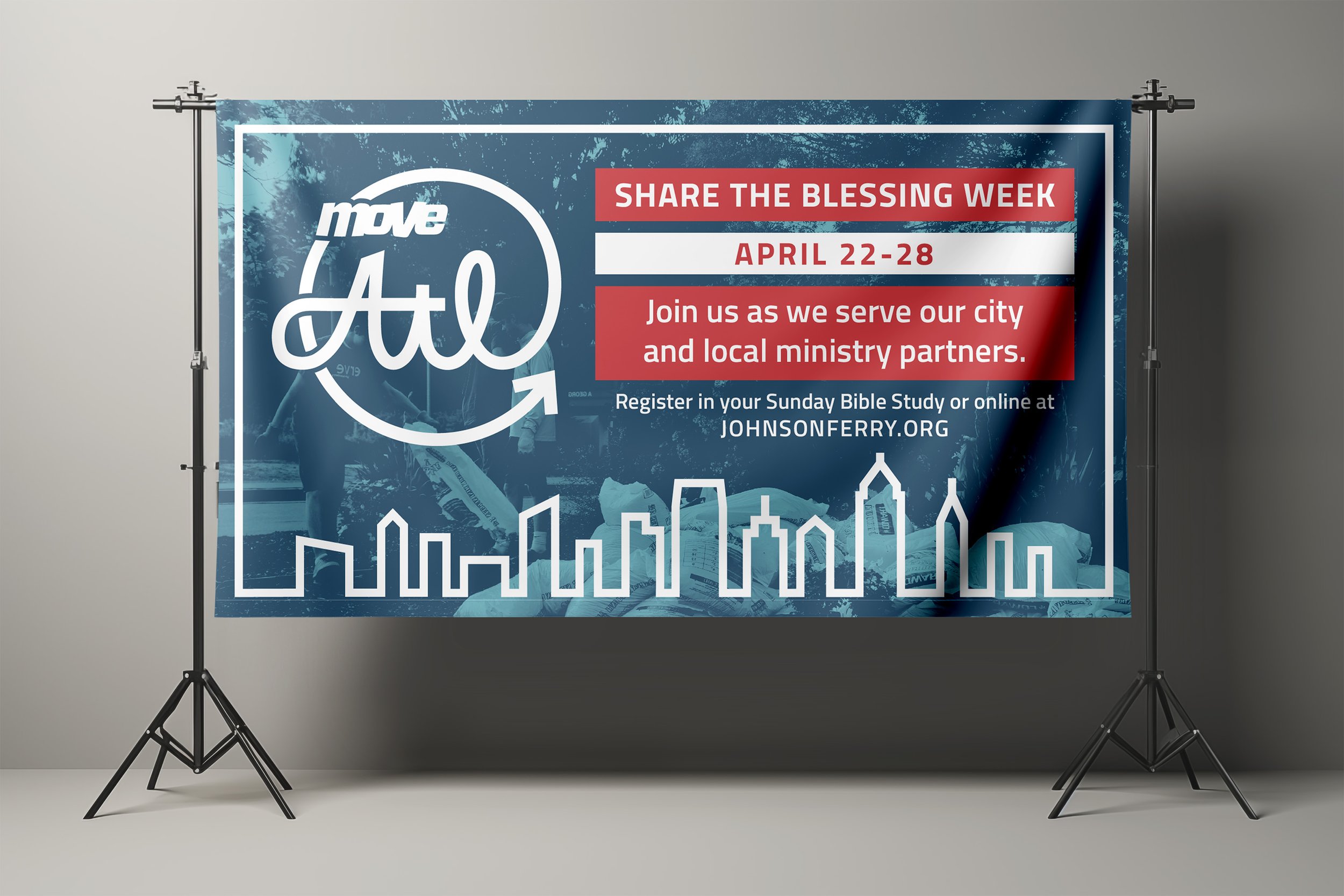
One of the events hosted after MOVE Conference was MOVE: Atl. This event mobilized hundreds of conference attendees plus their friends and families to support the very community they lived in. This event had yet to be given an identity under the established MOVE brand. Using hand-drawn type and a simplified Atlanta skyline, a visual identity was made and quickly implemented across several platforms.
